Project Description
26 May 2020
The data overload around the Coronavirus it got me a thinking a lot about the everything
from the connections to the infections and everything in between.
I asked myself "would it be possible to run some kind of mathematical model that modelled the possible infections.
Maybe even run it with a monte carlo".
I played around with some ideas and finally settled on trying out this simple model in python.
So the premise is simple,
- I create a population,
- I create connections between the individuals and then
- I roll the dice a few times (random number generator) to see what would the infections look like.
Hopefully the mathematical model would give me some insight into what the infection chain would
look like in certain scenarios.
I tried to model some parts on the real world where I could, but obviously overall the real world
is extremely more complex than the simple ~ 80 lines of code.
Technology involved
| Technology | Link |
|---|---|
| Python | Link to file |
| Gephi | Link to file |
| Tableau | Link to file |
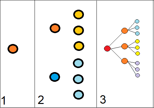
I started by creating the 1st layer of people, these would be akin to those who were exposed to infected international travellers.
The layer 1 is then connected to X amount of people, who in turn are connected to X amount of people,
connected to X people, etc , etc, etc
So quite simply I create a population with TotalPopulation = x + x^1 + x^2 + ... + x^y
X - being the how many connections, Y - being how many degress of seperation from layer 1
I eventually played around with a few different iterations but this is the starting point.
Ideally I would like to create the connections to connect over different clusters and layers, which would
mimic the real world a lot closer. There are a few ways I've though to do this but I wont delve
too deep in that now as it goes out of scope.
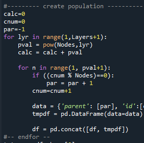
The dataframe design:
The layer 1 is then connected to X amount of people, who in turn are connected to X amount of people,
connected to X people, etc , etc, etc
So quite simply I create a population with TotalPopulation = x + x^1 + x^2 + ... + x^y
X - being the how many connections, Y - being how many degress of seperation from layer 1
I eventually played around with a few different iterations but this is the starting point.
Ideally I would like to create the connections to connect over different clusters and layers, which would
mimic the real world a lot closer. There are a few ways I've though to do this but I wont delve
too deep in that now as it goes out of scope.
The dataframe design:
| Column | Description |
|---|---|
| Parent | Who is your parent |
| Id | This persons unique ID Number |
| Layer | In which degree of separation do you belong |
| Infected | Is infected or not [1 – yes, 0 – No] |
| Wave | In which wave were you infected |
Non-essential:
| Column | Description |
|---|---|
| Log_rnd | Audit trail for what number was rolled on random |
| Log_parent | Audit trail, who was the parent that infected you. |
Python
Here are some comments and thoughts about approaching this problem in python.
Firstly working with Python has been absolutely amazing both due to the simplicity and power available by this language.
When you also start looking at the libraries available you realize how powerful this tool can be.
Getting back to the application, creating the population was a matter of creating x nodes for the parent.
So one had to loop through each parent and create the X new connections.
I would use the mod function to find when to move over to the next parent.
If I had 3 connections and 3 layers, it would results in something that was
Every "degree of seperation", aka layer, would have a population of pop=X^Y or
(eg) layer 2 would have 14^2 = 196 as 14 people know 14 people.
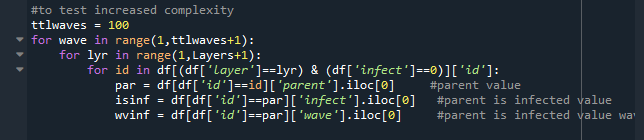
Once my population was established, I started by setting all infections to zero, and let the dice roll in layer 1.
In this algorithm is designed to only roll forward, so layer 1 can only infect layer 2, layer 2 to 3, etc.
What's also important to note is that once you have been infected, you cannot re-infect -
so if a new wave comes round you cannot start a chain of infections again.
The test came down to
- for each wave of infections
- go through each layer and in each layer
- go through each individual (to save time only go through non-infected individuals)
+ find if the parent is infected, if they are AND it was in the current wave
+ then roll the dice to see if they get infected
Here are some comments and thoughts about approaching this problem in python.
Firstly working with Python has been absolutely amazing both due to the simplicity and power available by this language.
When you also start looking at the libraries available you realize how powerful this tool can be.
Getting back to the application, creating the population was a matter of creating x nodes for the parent.
So one had to loop through each parent and create the X new connections.
I would use the mod function to find when to move over to the next parent.
If I had 3 connections and 3 layers, it would results in something that was
| Layer1 | Layer2 | Layer3 | Mod |
|---|---|---|---|
| A1 | B1 | C1 | 1 |
| A1 | B1 | C2 | 2 |
| A1 | B1 | C3 | 0 |
| A1 | B2 | C4 | 1 |
| A1 | B2 | C5 | 2 |
| A1 | B2 | C6 | 0 |
| A1 | B3 | C7 | 1 |
| A1 | B3 | C8 | 2 |
| A1 | B3 | C9 | 0 |
Every "degree of seperation", aka layer, would have a population of pop=X^Y or
(eg) layer 2 would have 14^2 = 196 as 14 people know 14 people.
Once my population was established, I started by setting all infections to zero, and let the dice roll in layer 1.
In this algorithm is designed to only roll forward, so layer 1 can only infect layer 2, layer 2 to 3, etc.
What's also important to note is that once you have been infected, you cannot re-infect -
so if a new wave comes round you cannot start a chain of infections again.
The test came down to
- for each wave of infections
- go through each layer and in each layer
- go through each individual (to save time only go through non-infected individuals)
+ find if the parent is infected, if they are AND it was in the current wave
+ then roll the dice to see if they get infected
Visualization - Gephi (side note)
I stumbled on a tool recently called Gephi which I found fascinating.
The specialization is that it helps to visualize connections and can often be found to help with either
Network layouts or (more popularly) social media connections like Facebook or Twitter.
Out of curiosity I decided to model some of the connections....I still need to figure out how to rotate the views on the z-axis,
but here are some of views from the different plugins.
It seems it grouped each layer as a cluster (in the 3rd pane).The reds are infected persons, and green is non-infected.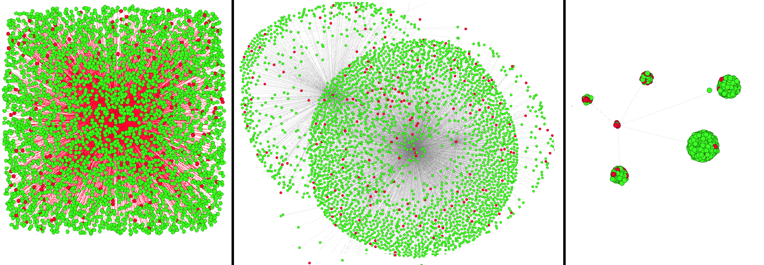
Findings
Once the python app completed a few iterations:
- 3 connections with 7 layers, total population of 3,279
- 6 connections with 6 layers, total population of 55,987
- 14 connections with 4 layers, total population of 41,370
(some of the iterations were very much influenced by computing power and time)
I used Tableau to help me visualize the data of the different iterations.
I mainly looked at 2 views -
(1) How many were infected per Layer (as people are connected), and
(2) How many were infected in each wave of new transmissions of the virus
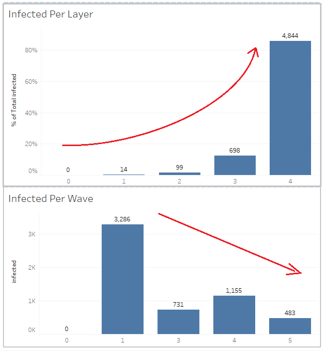
Result on the 14^4 configuration
Running the same model on a 6^6 configuration, one can see the story doesnt change much.
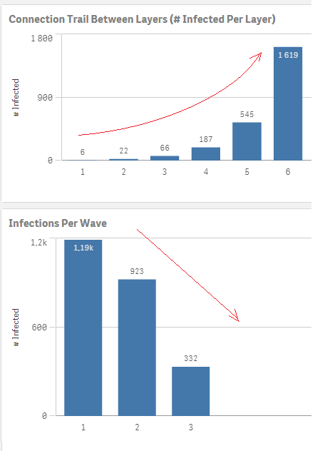
One of the more obvious conclusions is how the connections between people cause the virus to spread exponentially.
One can see the initial 14 people spread the virus to the other 5,641 individuals.
This is why so many governments are trying the lockdown approach, as they understand how easily things can get out of hand.
When playing around with one of the chains, 1 person (id:1) was responsible for infecting 307 people only by the 3rd layer!
Unfortunately with a disease like this, it shows complacency was not an option.
What's not surprising to me is the fact that with each wave less and less people become infected.
This would be due to the premise in the model that one cannot re-infect, so as more people in the
initial layers get infected, by the 4th, 5th,... layer they are not likely to start any new chains.
It's like a box of matchsticks that can only be used once, as more matchsticks get burned they cannot reignite.
This does not necessarily mean in the real world this will happen, as viruses can mutate and transform, etc
and people can get re-infected. The results are more specific to this test done in this generated environment.
I stumbled on a tool recently called Gephi which I found fascinating.
The specialization is that it helps to visualize connections and can often be found to help with either
Network layouts or (more popularly) social media connections like Facebook or Twitter.
Out of curiosity I decided to model some of the connections....I still need to figure out how to rotate the views on the z-axis,
but here are some of views from the different plugins.
It seems it grouped each layer as a cluster (in the 3rd pane).The reds are infected persons, and green is non-infected.
Findings
Once the python app completed a few iterations:
- 3 connections with 7 layers, total population of 3,279
- 6 connections with 6 layers, total population of 55,987
- 14 connections with 4 layers, total population of 41,370
(some of the iterations were very much influenced by computing power and time)
I used Tableau to help me visualize the data of the different iterations.
I mainly looked at 2 views -
(1) How many were infected per Layer (as people are connected), and
(2) How many were infected in each wave of new transmissions of the virus
Result on the 14^4 configuration
Running the same model on a 6^6 configuration, one can see the story doesnt change much.
One of the more obvious conclusions is how the connections between people cause the virus to spread exponentially.
One can see the initial 14 people spread the virus to the other 5,641 individuals.
This is why so many governments are trying the lockdown approach, as they understand how easily things can get out of hand.
When playing around with one of the chains, 1 person (id:1) was responsible for infecting 307 people only by the 3rd layer!
Unfortunately with a disease like this, it shows complacency was not an option.
What's not surprising to me is the fact that with each wave less and less people become infected.
This would be due to the premise in the model that one cannot re-infect, so as more people in the
initial layers get infected, by the 4th, 5th,... layer they are not likely to start any new chains.
It's like a box of matchsticks that can only be used once, as more matchsticks get burned they cannot reignite.
This does not necessarily mean in the real world this will happen, as viruses can mutate and transform, etc
and people can get re-infected. The results are more specific to this test done in this generated environment.
I hope you enjoyed this as much as I had fun playing around with it.
If you have any queries or comments let me know in the contact section!
If you have any queries or comments let me know in the contact section!
Created by RH [2020]